Automated Research Repository
Client
Personal Project
Year
2023 – 2024
Services
UX Research
Data Visualization
Research Ops
Context & Challenge
At Hotmart (a leading creator economy platform serving 30M+ users), user satisfaction data was scattered across multiple disconnected sources: CSAT surveys, NPS scores, and support tickets. There was no consolidated view, which made evidence-based backlog prioritization nearly impossible.
Product teams were making decisions based on gut feeling or whoever spoke loudest in the room. The challenge: build a system that centralizes, categorizes, and visualizes all this feedback automatically, and actually gets used.
My Role
UX Researcher responsible for conceiving, structuring, and implementing the entire repository from scratch. I worked cross-functionally with Product Managers, data analysts, and engineers to build something that lived at the intersection of research, data, and product strategy.
Process
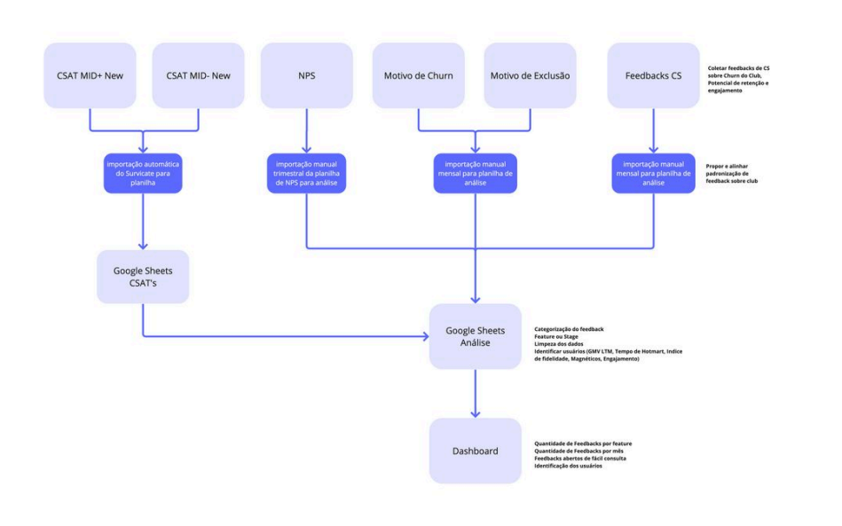
I started by mapping every existing data source (surveys, NPS tools, support ticket systems) and understanding how (or if) teams were using them.
Then I defined a taxonomy for automatic categorization: tags, themes, and severity levels that could be applied without manual effort. This was the hardest part: the categories had to be specific enough to be useful but broad enough to scale.
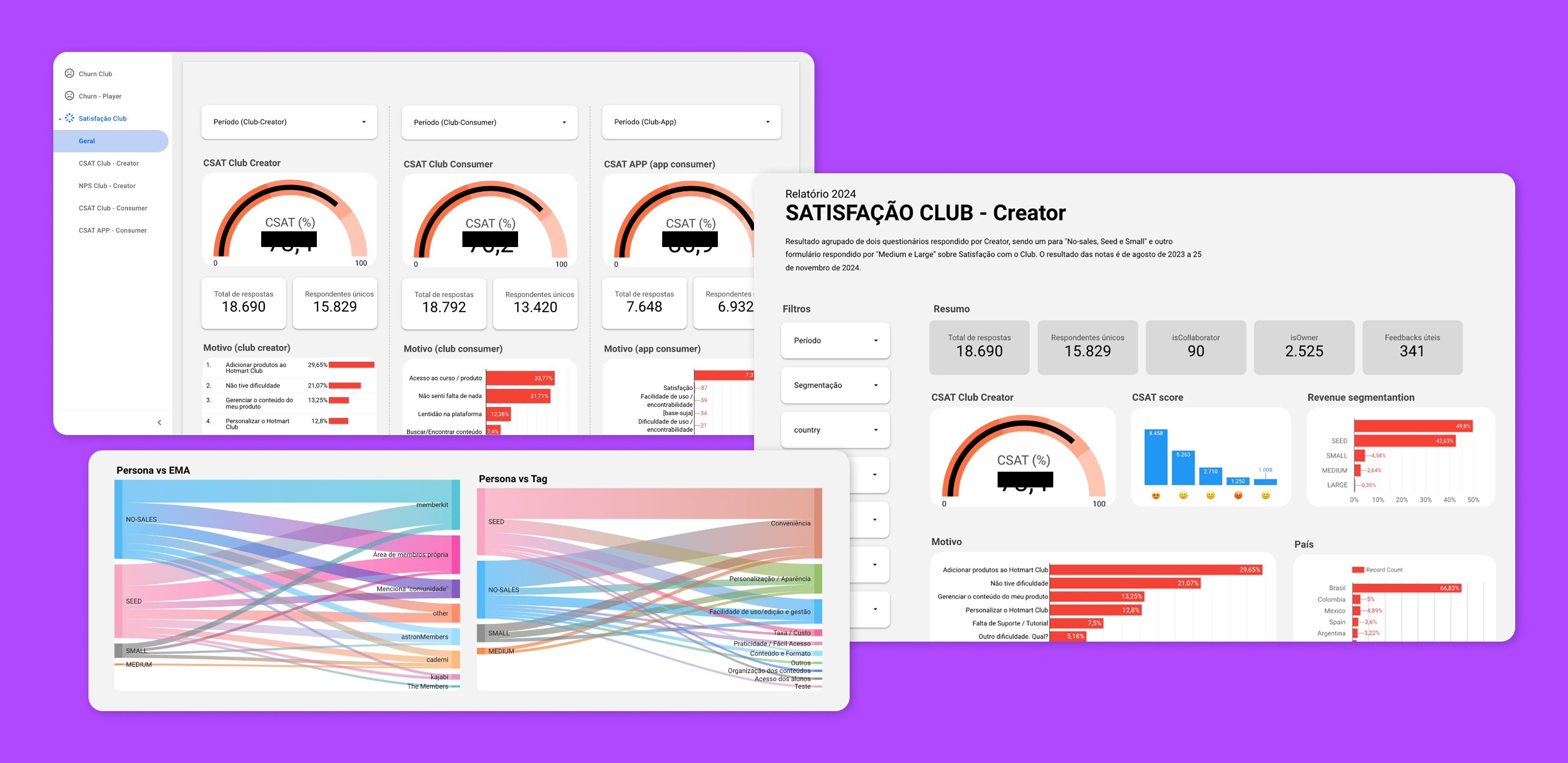
I built interactive dashboards in Looker Studio, choosing it for accessibility and integration with the existing tech stack. The key constraint: PMs had to be able to use it without training.
I tested dashboard usability directly with PMs, observing how they navigated, what confused them, what they ignored. Several iterations came from watching people try to find answers and fail.
Key Decisions
Automatic categorization over manual tagging
tags and categories applied automatically based on keyword patterns and source metadata. This removed the bottleneck of someone having to manually classify every piece of feedback.
Dashboard as a prioritization tool, not just a report
the dashboard wasn't designed to look good in a review meeting. It was designed to be the first place PMs go when deciding what to build next. That meant filtering by impact, recency, and volume, not just showing pie charts.
Looker Studio for accessibility
chose Looker over custom-built solutions because every PM already had access and knew the basics. Adoption > sophistication.
Results
Dashboard became the primary input for product backlog prioritization
CSAT, NPS, and support ticket data consolidated into a single source of truth
Significant reduction in time spent on manual feedback analysis
Adopted by multiple product teams across the organization
Shifted team culture toward evidence-based decision making